01The problem
What was broken
The earlier hero led with the venue name and a general description. A viewing option and an explore-spaces action were not visible in that hero.

A venue homepage redesign with a refreshed identity, exterior-led imagery and clear choices to explore spaces, book a viewing or start a booking.
The earlier hero led with the venue name and a general description. A viewing option and an explore-spaces action were not visible in that hero.
Introduced a refreshed identity, exterior venue photography and a more specific headline. Added separate Book Now, Book a Viewing and Explore Spaces actions in the hero.
The redesigned homepage presents the venue and its next steps more explicitly. The screenshots demonstrate the design change, not a measured increase in bookings.
Give visitors a choice between exploring the venue, arranging a viewing and moving towards a booking.
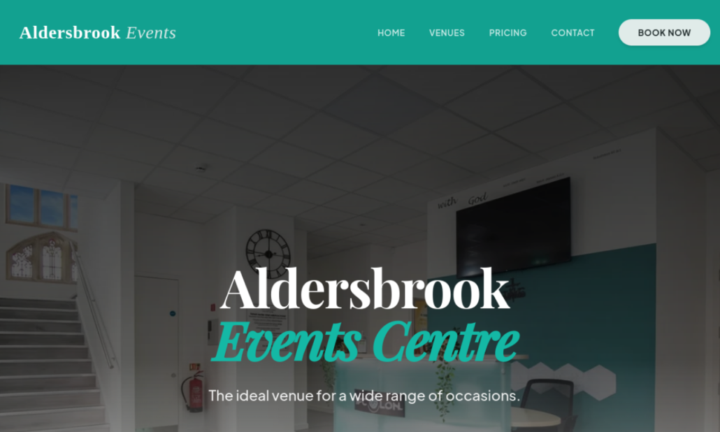
Earlier homepage: venue-name-led hero, interior photograph and a general venue description.
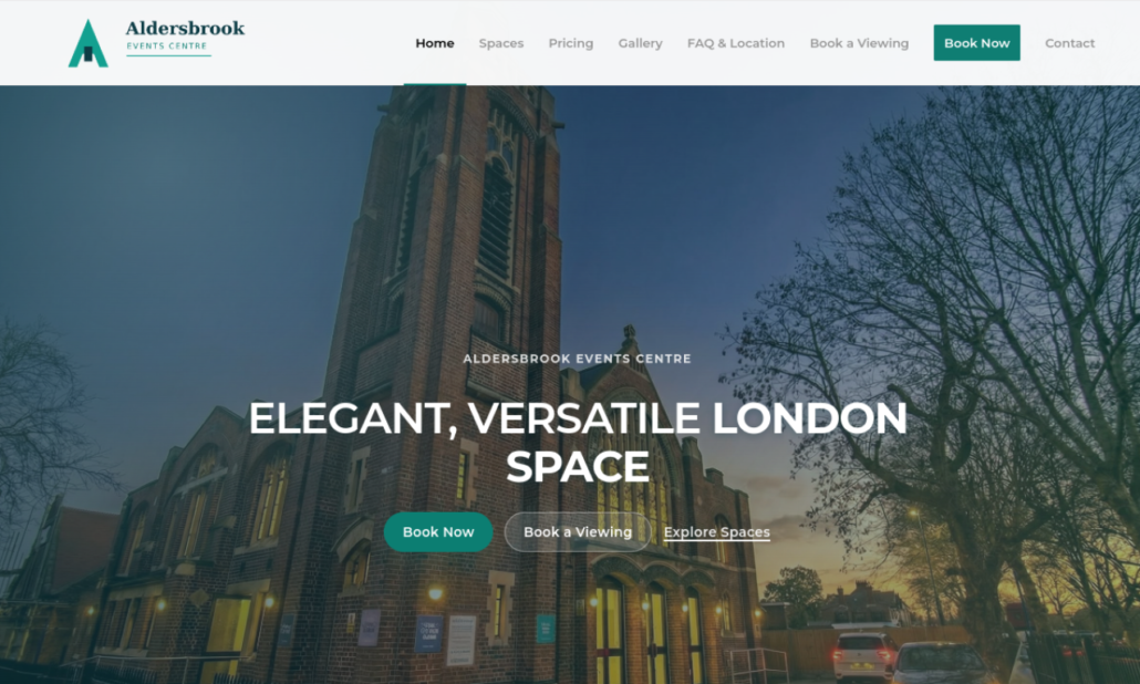
Redesigned homepage: refreshed identity, exterior photography and separate booking, viewing and space-discovery actions.
We can map the bottleneck, prioritise what to fix first, and tell you honestly whether EKN is the right fit.
 Safari Food: a distinctive catering website redesign
We use cookies to keep the site working, understand performance, and improve marketing. You can accept all, reject non-essential cookies, or manage your preferences.
Read privacy policyNeeded for security, accessibility, and core site functionality. These are always on.